Showing posts with label Art - College. Show all posts

May 3, 2012

Something a little different...

Here is my latest show entry—I entered it into the end of semester show for the final show of my undergrad.
weird.

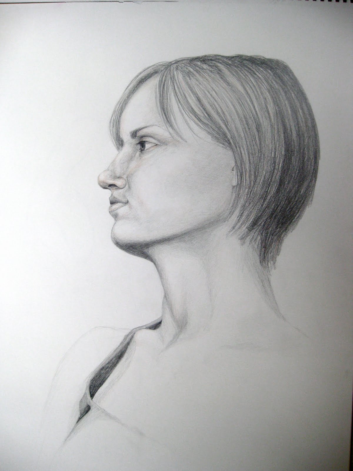
So this is the piece I offered a little "sneak peak" to a few weeks ago.  not my usual style or subject matter, but they asked for "conceptual", and this is what they got.  More creepy that I usually care to do—I feel like I have fallen into the typical category of "depressed art student", though I am far from it in actuality.

Just in case the "message" is not very clear, allow me to expand on my inspiration a little.  I've been talking with some of the girls that I mentor, and just some that I know closely, and have become more aware of the pain that girls inflict upon themselves in order to be accepted by society—not just anorexia, though that is a more well known issue.  Slowly, these girls kill themselves, hardly able to keep themselves "above water" (represented by the horizontal).  Thankfully, I do not know any girls who are in a position quite that bad, but I do know plenty about how society works against us and pushes girls (boys too, but we're talking my drawing of a girl right now...) to become the impossible "perfect".

The awesome thing is that God is in control—and He allows us to be vulnerable to Himself.  And in exposing what we are going through, the pain of what we have lived through—whatever it may be—we allow Him to come in and provide the necessary healing.

God is so good.  It's hard to grasp how nobody can be too "terrible", too "full of sin", too "unclean" for Him to reach—just look at Manasseh from 2 Kings 21!  He was described as the worst king to ever live, and he had "shed so much innocent blood that he filled Jerusalem from end to end—besides the sin that he had caused Judah to commit..." (v.16).  Yet, when Manasseh turned to God at the end of his life, God forgave him, loved him and even blessed him—he did not bring the punishment that the people deserved while Manasseh was living.

Feedback is welcome and encouraged as always—I'm considering bringing the line down a little more and maybe allowing it to fade higher.  Thoughts?

.

Feb 11, 2012

Senior Art Show—Advertising

*Drum roll, please*

[Just in case you did not catch on from previous posts]
I am officially having a senior show!  The art show is the goal of art students at Spring Arbor University, but it has been an especially difficult run for me because I have two different concentrations (not to say that it doesn't happen, but within a 4 year block, it is difficult).

Along with two other students, I will be filling a portion of the gallery (somewhere between 35 and 40 pieces) and preparing for the opening reception to take place on March 4th, 2012.  Before the opening, I will have to tweak and complete, mat, frame and hang each piece individually.  Needless to say, it has been a stressful few weeks (since I did not know I was going to have a show until the 30th of January!)

Along with getting those pieces together, I also needed to create a poster and postcard design to advertise the show, as well as keep up on other homework, work related things, write an artist statement and sleep—not to mention my delightful blog.  It has been a very busy time!

Anyway, here is my poster design :)  I don't have a single piece that really sums up my show because of my two concentrations (not to mention, graphic design being so broad in and of itself), so I came up with this idea to translate both emphasis for me.
Sometimes the poster will be hung in one direction: (emphasizing my graphic design)


And sometimes, in the other: (emphasizing my illustrations)


Thus allowing both of my strengths to be displayed, and hopefully to create some real interest :) We'll see how well they work!  Thoughts? (unfortunately I posted one of the older ones—in the final addition, the typographic portrait read better on the left side, but my flash drive is on the other side of the room and I'm honestly too lazy to go get it right now!)

The opening reception is fast approaching—I hope to see you all there!

Oh, and remember me and my craziness in your prayers when you get a chance :) Thanks all!


.

Feb 7, 2012

Art Show Progress

If you don't know that I'm a list person... then, you don't know me very well! lol
So I have a master list for the art show and all the craziness that comes with it—it is my key to survival over the next few weeks.
Everything is white/gray when it is unfinished, yellow when printed, and green/blue when I finally finish it (so a random blue square could mean that I have the frame or the glass, but nothing else, an entire blue/green line means a piece is completely done!)

Here is a picture of my list about a week ago:


And here is my list TODAY:


YAY for progress!  I wore blue today in honor of all the blue highlighter going around! haha Hopefully I can kick out these last pieces and start working on my new projects :D
(and catching up on all the homework I haven't done while matting and framing... :/


.

Feb 4, 2012

Progress

Cell phone photo, but you can still see some of my mock ups!  Here are the book covers that are going to be in my show :D  I just printed the last one yesterday and it's super cool :)  After seeing them on the computer for so long, it's really neat to have it look like a REAL BOOK!

Now I just need to finish my other mock ups and all of the mating/framing that i need to do :/
But it's coming along nicely—and I have wonderful friends and family who help out a lot!  Mom is bringing me glass and mat board (because the store here is out of black! And has been for three weeks! RUDE), and Beej is helping me to frame later today so that it won't take me as long :) YAY

God is good, and has blessed me so much :}

ps. Super Awesome Fiancee surprised me and came to visit yesterday, even though he was in a hurry to get from SCS work to SBC work, and I am out of the way :)  All because the day before had been yuck for me
Double yay!


.

Jan 23, 2012

From Illustration To Cover

Here is the book cover that I've been working on (title/author is a real book that I borrowed for my idea—I thought her title was hilarious).  There are still a few color things that I might change—specifically with the author's name, I have been going back and forth with what color to make that stripe...


Anyway, this piece will be featured in my senior show! YAY
But because I"m having a senior show... I need to get back to work... NOW!

Sep 29, 2011

Waterslide Event Poster


Here is my first poster design of the semester!  Feedback is MORE than welcome, in fact, it is required :)  This piece is headed towards my final portfolio and, hopefully, my senior show! So please be brutal, I really want to improve and finish this piece soon.

Oh, and the background isn't supposed to be that horrid green color—it's really a mid-dark robin's egg blue

Concerns: The heading "Waterslide!", is supposed to be easily seen, but on the distracting background (which is a mid-tone, so doesn't show up as well), I'm afraid that it doesn't have the emphasis it needs.
Also concerned with the information—had fun with it, but is it too distracting?
Feedback please!

Hopefully more work soon :)

Mar 21, 2011

Artist's Prayer

Dear Heavenly Father,


Thank You for the artistic abilities You have given me. The vein of creativity in me has sometimes been wide as a river, and other times as narrow as a thread. With Your Divine guidance, I ask that You would open my mind and heart to the creativity You planted in me from before I was born. May my art work be an inspiration to others, but more importantly, always be honoring to You.


Amen

Oct 24, 2010

AC logo—finished


Here's the final product. As you can see, my previous brainstorms came up pretty empty! haha, but at least I finally found out what worked (sort of...). I was really excited about this piece, because both myself and my professor liked it and we worked out some of the issues that I had with it. But during the critique on Thursday it was revealed that my classmates were less than thrilled. Actually, I got very little positive feedback. Almost none. It was pretty pathetic to see my professor try to defend me. So yeah, talk about frustrating. But hopefully because I was able to satisfy the customer, I will end up with a better grade. Update soon hopefully!

Updated: 10-26-2010
I got an "A"!!! And it is up on the work of the week board!
I'm super excited, haha—I needed this ego boost

Aug 24, 2010

Pencil Symbol


This project is from intro to graphic design. I didn't end up going with this one, and handed in the leaf symbol instead (you can read more about the assignment by clicking on the link). But I liked this project anyway and started thinking about it a little while ago so I thought I would post it. It's still could use a little something, but I'm not sure what... Anyway, I didn't end up going in this direction so I never needed to explore my options.
I was trying to visually show a child's creativity / imagination. Not sure how well I did...
We'll see if it ever goes anywhere in the future...

Aug 19, 2010

Still Unfinished Work


Another update on some unfinished work. I've spent about 30 hours on this piece and I only have to finish up the background and it's done... but I have very little motivation to do that after so many hours!
So I think tomorrow afternoon will conclude this piece and a true illustration of how I waste my time will be available for ridicule from the public.

I'll also post a photo of the model so that you can correct all of my mistakes.
Until later

Aug 17, 2010

Let's Face It


So here are some of my head shots. Oddly enough most of these are profiles—but I guess that's because most of what liked that was 3/4 view ended up hanging up somewhere around campus. Keep in mind that most of these are unfinished and will probably remain so...
The contour of the girl with the under-bite was my first success of the semester. I was having a lot of trouble catching a decent likeness until Amber modeled—after that I had an easier time. Thankfully something finally clicked!
All of these drawings were done in pencil—most likely HB, B or 2B on Newsprint (top two) and drawing paper (bottom two).

Better Late than Never...


Okay so here are some of my drawings from Figure Drawing this past spring. These first few were done in colored pencil. Just a small peak at what I spent most of the semester doing. I am still unsure if I will be showing any of my other full-figure drawings...

May 9, 2010

Art Show—Spring 2010


The art show has come once again. And two of my pieces are in the show! I am very excited, though I am a little disappointed that my other two pieces did not get into the show. I was also selected by my professors to receive the "William L. Bippes Art Scholarship"! This scholarship is given based on work ethic and performance along with a few other aspects. The scholarship is given to a sophomore or a junior every year—as a sophomore I feel so honored! I'm the third person to win it since it began, and I am so excited to have my name in the art building :D It sounds so stupid, but I look so forward to coming to visit after I graduate and seeing my name. Featured are the pieces I have hanging up in the art center :)

Apr 30, 2010

Personal ID system


Incase you don't remember, I had to make a personal identity system for my graphic design class a few months ago. I never had a chance to load everything up, but here's what I finally ended up with. The blurry patches on the letterhead, and CD labels are where the address and Email would go—but I originally had some accurate information on those so I blocked them out :)
The rest is fake.
I got an A- on this project over all. I still have to tweak the logo, but other than that it's finished for now. I really want to go back into it over the summer and come up with something more creative, but I didn't have time during the semester because I completely revised the logo the day before it was due (stupid, but it looks much better!)

Feedback is welcome as always!

Mar 28, 2010

George White, the Skeleton


This is my super-creepy-skeleton. His name is George—he used to be alive and living in India, but now he stands in our classroom. We have recently given him a last name: White (credit to Bethany A), and I believe he stands a little taller now that he has gained this new social status!
Anyway, this is my latest drawing piece—it was done with chalk and white and black charcoal on black paper. It was a BLAST, but it took a long time. I have estimated it to be around 20 hours, but I lost count after a while.

All credit goes to God—especially with this piece. The first day I just couldn't do it. My hands were completely useless... I remember running back to my room after about two hours and just breaking down. I prayed and told God that I couldn't do it (like He didn't already know... psh) and that it was entirely up to Him. Once again, I had to give my work over to Him. My talents don't belong to me—the only thing that I can do is dedicate my time, and give Him the glory!

I was given an "A/A-/A" on this piece... I'm not entirely sure what that means, but I can live with it. I was given something to improve on, so hopefully an updated (and better quality) photo will be up shortly.
Possibly a show piece in the near future... we'll see :)

Mar 23, 2010

Word Project


This was my first project for Graphic Design 1:
We were instructed to select a word and then use typography in order to make that word into the thing or action that it represented. I chose "crown" and used a script style font as a base for creating the little girl's crown. The original piece was a drawing (bottom) and I spent an entire weekend stippling, only to find out that we were then going to convert the entire thing onto Illustrator (by hand, no cheating). Well, after almost dieing, I was informed that another classmate and myself would not be forced to do the entire project again on illustrator—but the majority would be required.
Professor Shaw said that I would not have to entirely match the hair as long as I could recreate a similar effect (easier said than done) and that the face could consist of line rather than stippling.
So after another long week of work I was able to recreate my drawing on Illustrator (top).
For the original illustration I received an "A-", marked down for inconsistent style in the figure. The Illustrator recreation was given an "A"(the main objective being an identical copy of the original—focusing on the word).

Mar 4, 2010

Five Fingered Friend


These hands are my latest homework assignment (graded) for Drawing II. We were required to make 5 hand drawings following the procedure
we were taught in class.


Step 1: Key line (lightest color—usually yellow/orange on mine)
Step 2: Draw the major masses. Basically, make sausage-like links to represent the fingers. Be careful to overlap them in order to predict the placement of the folds
Step 3: Draw the contour (the outline of the hand in the darkest color)

I only got a "B" on this project. I was pretty disappointed, but I'm moving on :)
Bippes encouraged me to explore harder poses—with more twists specifically. And I should not do as much shading... oh well, maybe next time I'll snag that "A"!

Feb 6, 2010

Ralph

This is Ralph. Fully developed—just before I ruined it by labeling the bones as is required.
I had to draw a contour, shade and then label the bones in the cranium and mandible(jaw bone).
I just found out that this project is a plus/minus project—meaning that I get full credit just for doing it, no grade. I'm bummed, especially after working so long on it (6-7 hours), but he's also using this as a chance to see where we are and what we need to improve on. So, hopefully I did a good enough job that he will find it worth his while to push me a little extra. Of course many my classmates also did a good well on theirs—and one of the best was from the same viewpoint as mine... which isn't always desirable.
The labeling looks horrid to be honest. It broke my heart to do it, but I want the grade! oh well, it wouldn't take too much work to get them off again, though a faint outline will probably always be there.
Feedback is welcome as always!

Jan 1, 2010

Clouds, Color, a Ship, and an Art Major


I love this photo and I've been waiting for an excuse to use it—but it has been 6 months and I'm sick of waiting! So, until further notice this photo will be posted on it's own, with only a simple note, describing my love for it.
I love this photo because of the color and the clouds :) My heart melts when beautiful cloud formations dance with color like this. I also love it because I was there (Lake Michigan) with my family. It was our final time together before I went back to SAU. I also like the detail on the ship and how dark it is in contrast to the rest of the photo, drawing your eye directly to it.

Dec 8, 2009

Visual Chapter Project


This poster represents a chapter in my Intro to GD book.  I was really excited about this piece, and I got an "A-", which isn't bad :)
My poster represents Art Deco and Plakatstil—as well as posters from the World Wars (thus Uncle Sam's addition)
I was really proud of it, but in hind sight it's not that wonderful—and my professor was not very impressed with my plakatstil illustration...